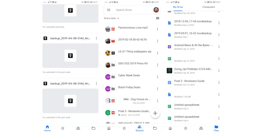
Google has been revamping a lot of their applications with a fresher look and feel. You may have been witness to a few such as the Google Calendar, the Google Phone app, Messages etc.
![]()
![]()
Seems like last week it was the turn of the Google Drive to get a facelift. I don’t know exactly when that happened but the interface this change quite a bit to my surprise. I’ll include some screenshots of the interface and how it looks, you can be the judge for yourself. I think they should also have included a dark mode to Google Drive. I can’t wait to see the dark mode for the Google Calendar.
Here are some of the changes:
- New home tab and bottom navigation.
- Expanded search bar.
- My Drive, Team Drives and Computers in Files view.
- New account switching experience.
- Revised actions menu.
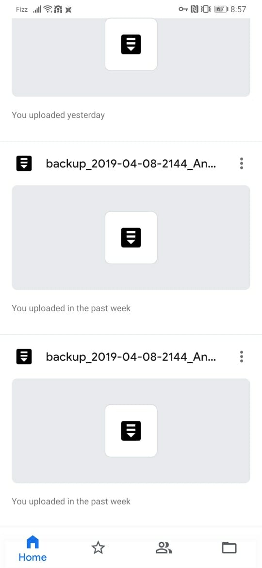


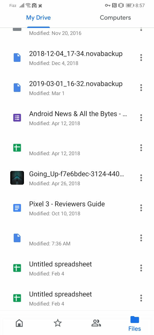

The new look is in line with other updates to the app ecosystem. The bottom nav bar for easier access makes some definite sense. The Drive Mobile redesign aims to make these workflows easier.
[appbox googleplay com.google.android.apps.docs]


