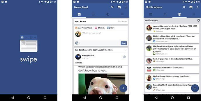
Want to browse Facebook in a better way? I recommend you look at Swipe! Swipe is a wrapper for the famous Facebook site that everyone is familiar with. What you may not know is that Swipe wraps itself around the mobile version to deliver a leaner, faster, better experience for Facebook.
Swipe is definitely an alternative to the power hungry app that Facebook is. It, however, isn’t a complete replacement as there’s some downfall to using such application. I believe that the positive outweighs the downside of such thing.
With the use of the API wrapper for Facebook that’s available, we have applications like Swipe that comes into play to make things better for us. We are provided with a leaner version, a faster experience, nice looking environment and overall just enjoyable.
What you may have some issues with is getting notified, the notification is not based on “push” notification as most are used to, it’s base on an interval timer that you as the user of the application can choose. This could put some people off especially if you’re looking to get notified the moment you get something on your Facebook.
One of the awesome features, is the ability to change the theme of how Facebook gets displayed to you. I’ve got mine set on AMOLED which really helps at reducing the consumption of my battery.
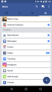
The rest of the experience remains almost the same. You may find different things that you like or not, but in the end, it’s based on preferences.
      |
I highly recommend that you go for the “PRO” version, it offers a lot more in terms of features and I don’t think you’d regret it.


